Bobby King

Case study: designing an AI-powered dashboard
I worked with data scientists to launch a data platform with AI insights, the Get adult social care data service (opens in a new tab).
The brief
At the end of 2024 English adult social care workers (such as care home managers) faced multiple challenges. These included staff shortages, financial pressures and a changing industry - from elderly people in residential care to being looked after at home.
Our research showed that the public sector had a lot of useful data but it was held by different organisations and it wasn’t easy to collate. We aimed to offer a single platform which combined data from different sources to help people with decision making, such as when to hire staff or start a new care home.
Our stakeholders included the Department for Health and Social Care (DHSC) and the Department for Science, Innovation and Technology (DSIT). Making data accessible has a huge potential for making the public sector more efficient.
What I did
Collaborated with data scientists and developers
Data platforms are a new paradigm for UX so the project required a fresh approach.
I worked with a talented content designer who could also build govuk prototypes. We shared a prototype on GitHub and he designed a landing page as well as a log-in and password reset process. This freed me up to work on the details of the data platform.
I worked closely with data scientists to work out how each page would work. Sometimes I would use indicative data to test people’s reactions. I preferred to use real data such as from the Office of National Statistics or LG Inform (opens in a new tab) but real data is time consuming to collect and refine. So, we also used realistic (but not real) metrics.
We also worked with data scientists on ‘smart insights’ to comment on the data after the user had picked a selection of metrics. I arranged weekly catch-ups to make sure the narrative was aligned with my visualisations.
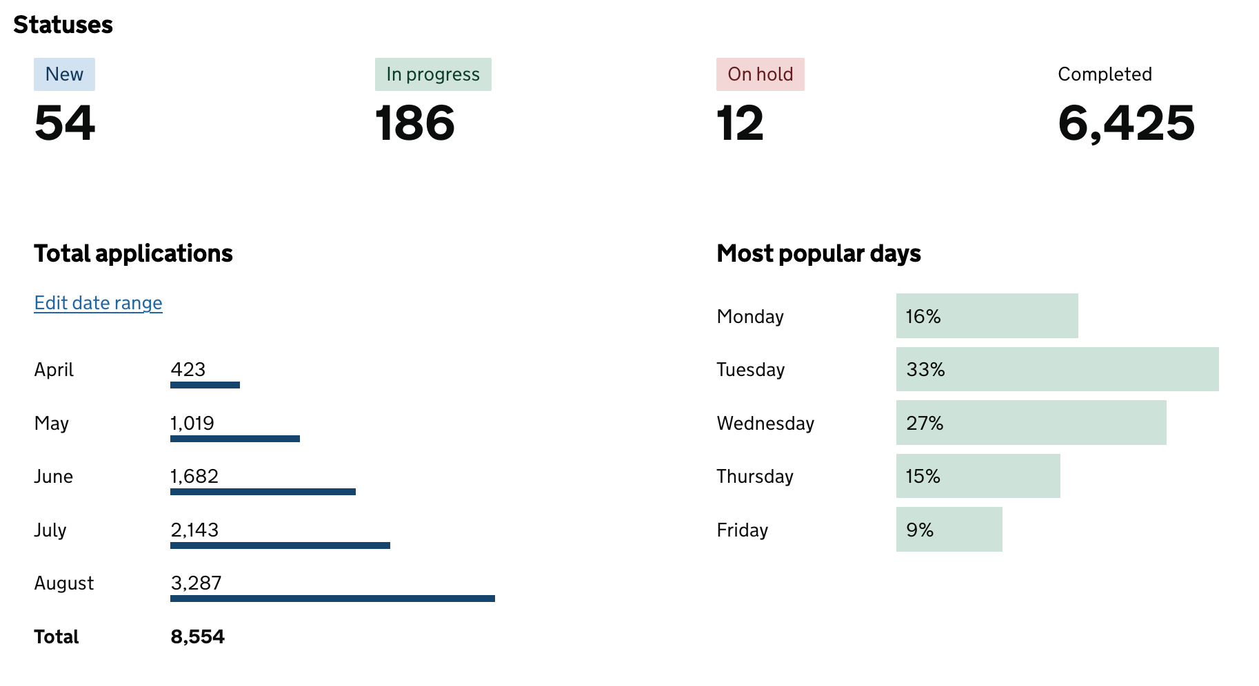
Created interactive charts and maps
I learned new libraries so that I could make realistic prototypes to test on local authority staff.
The development team used D3.js to render data visualisations so I used this to create line and bar charts. I also implemented LeafletJS to create interactive maps of care homes within a local area.
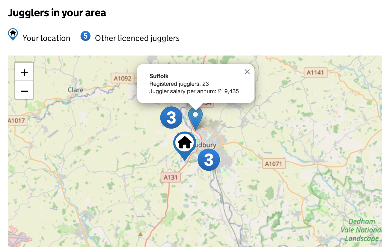
Users had a positive response to the maps, in particular – we started to realise that letting people interact with the data is just as important as picking data for them to view.
Ran accessibility meetings with the whole team
I started a monthly catch-up with the designers, developers and researchers. We came up with tasks to make sure the new platform would be accessible. This included:
- Picking components from the govuk design system and writing accessible content for each page
- Using automated testing on the build with aXe toolbar to test each page
- Running user research sessions with people who have accessibility needs
- Checking data visualisations included descriptions
The outcome
We successfully launched a private Beta in Spring 2025. Our diagnostic testing showed the platform could be accessed by a wide variety of people.